
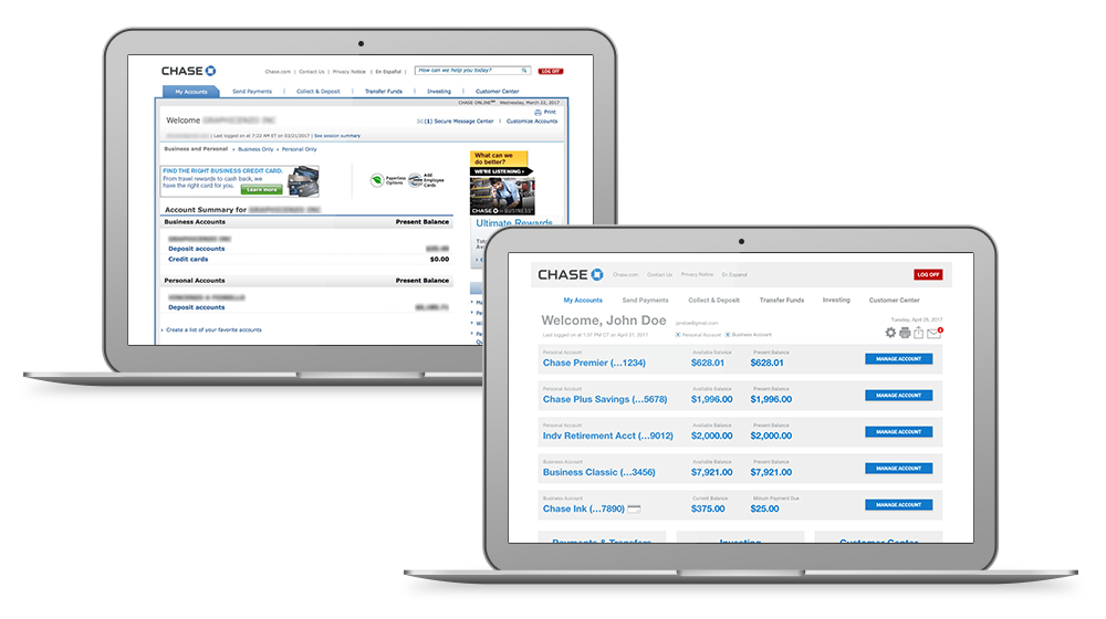
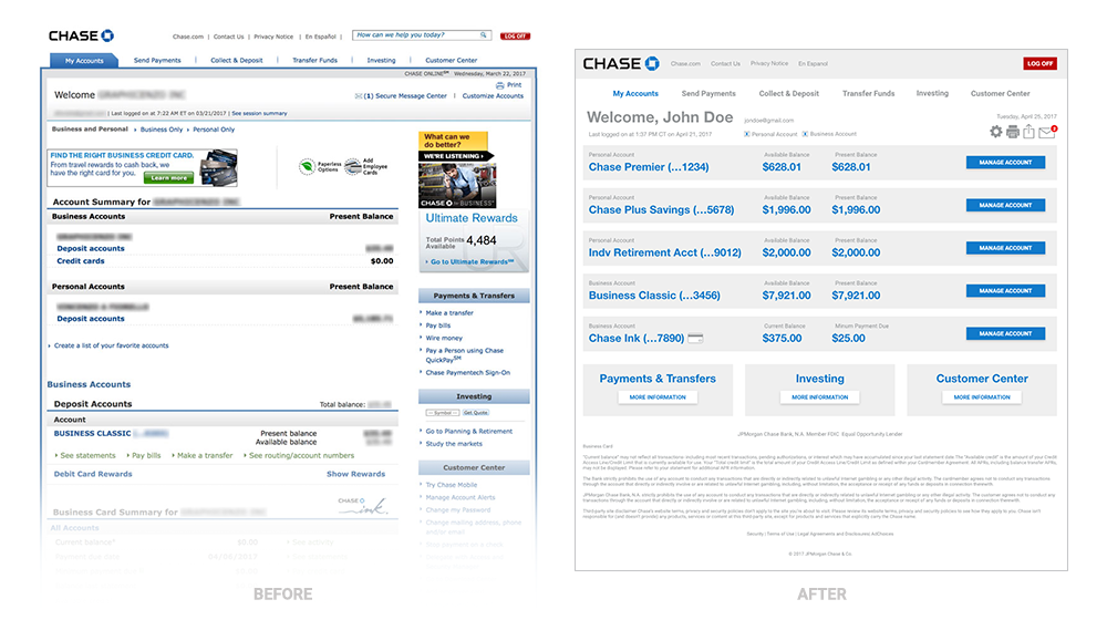
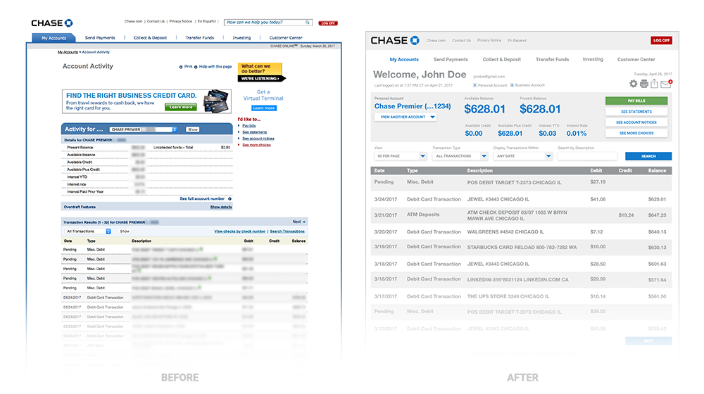
Chase.com (Before and After)
Pain Points
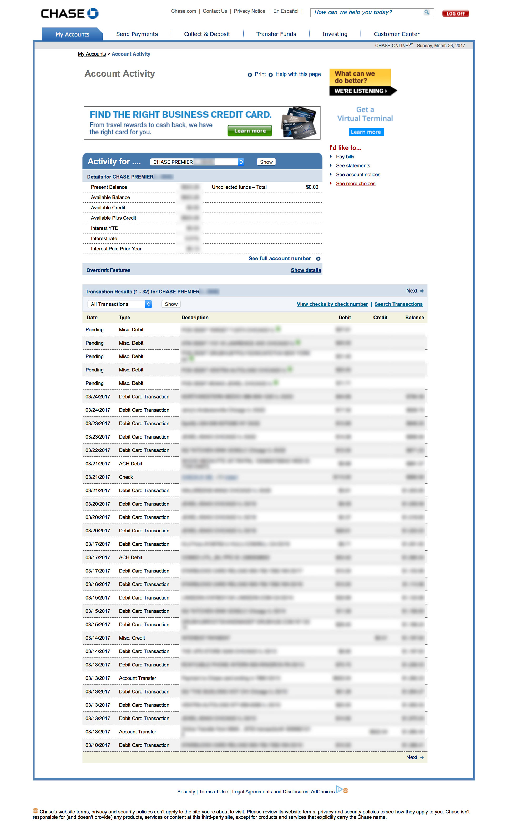
1) The account page is hard to navigate.
2) There is too much copy and not enough graphic elements.
3) There is no clear account separation.
4) The account summary and details pages are not in line visually with homepage.
Solutions
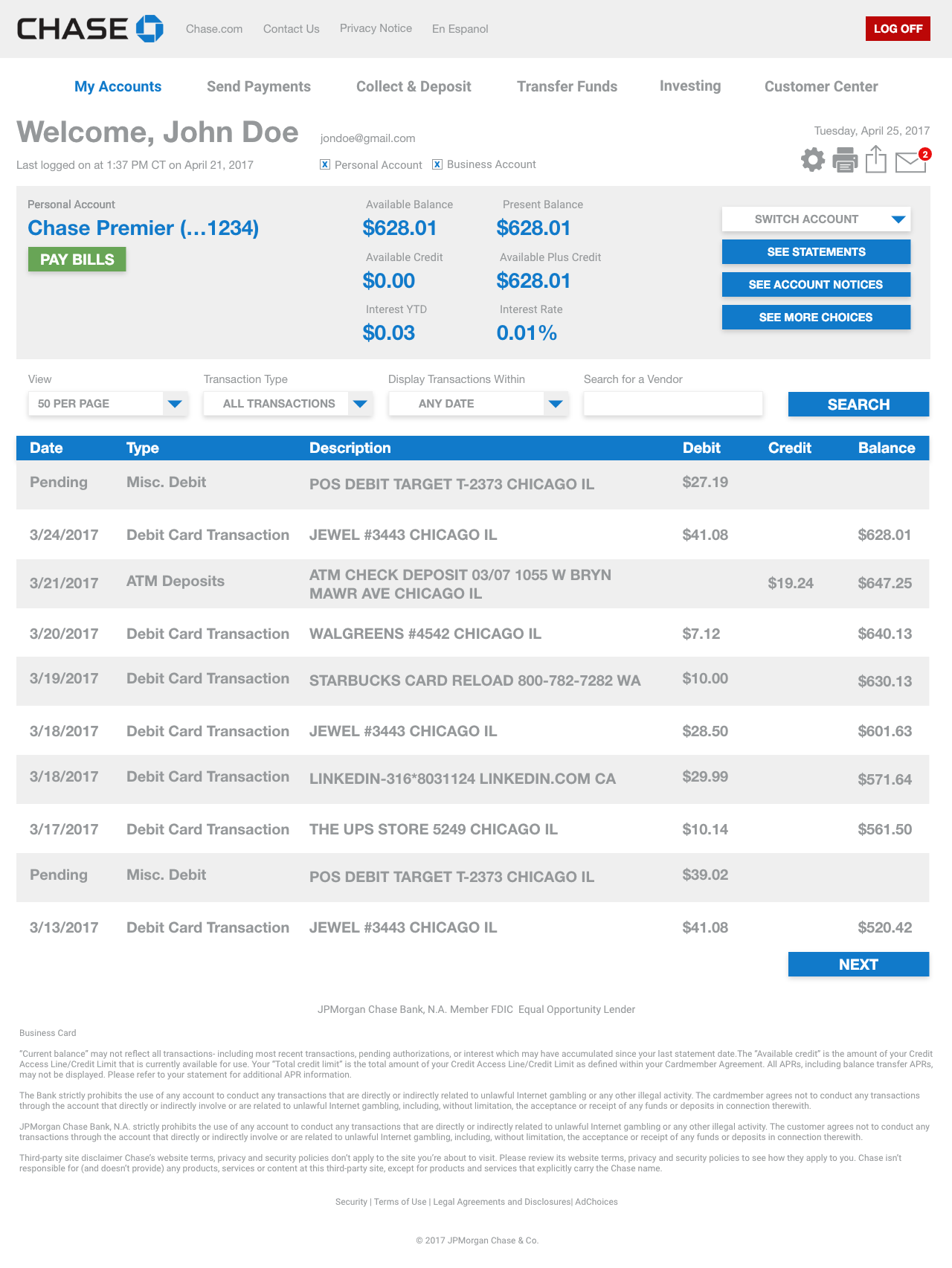
1) Simplify the pages by removing/condensing unnecessary information from the pages.
2) Add clear visuals to guide user through the page.
Audience
Chase customers looking for easy access to their account information.
Research
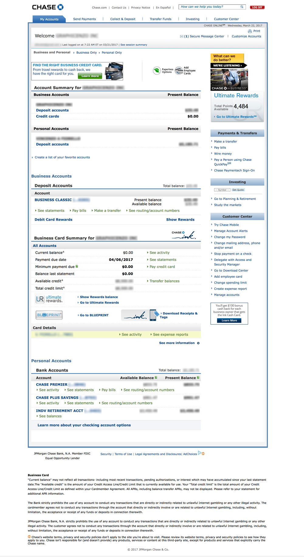
Below are a few samples of other financial institution account pages:
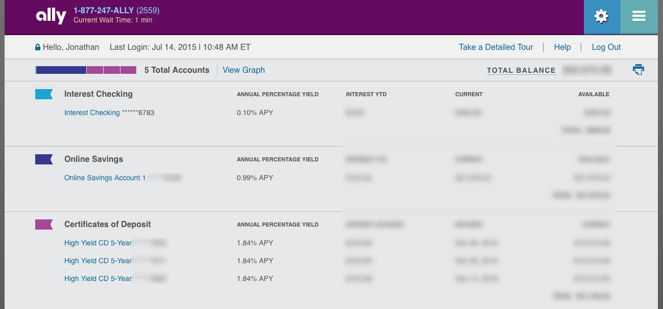
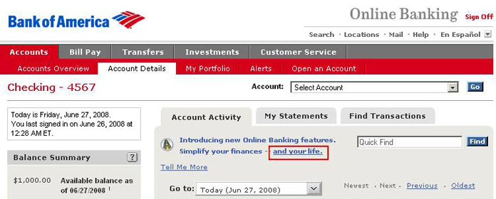
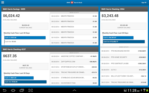
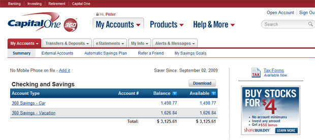
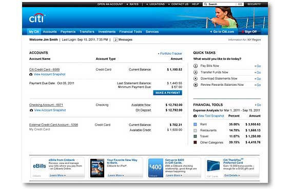

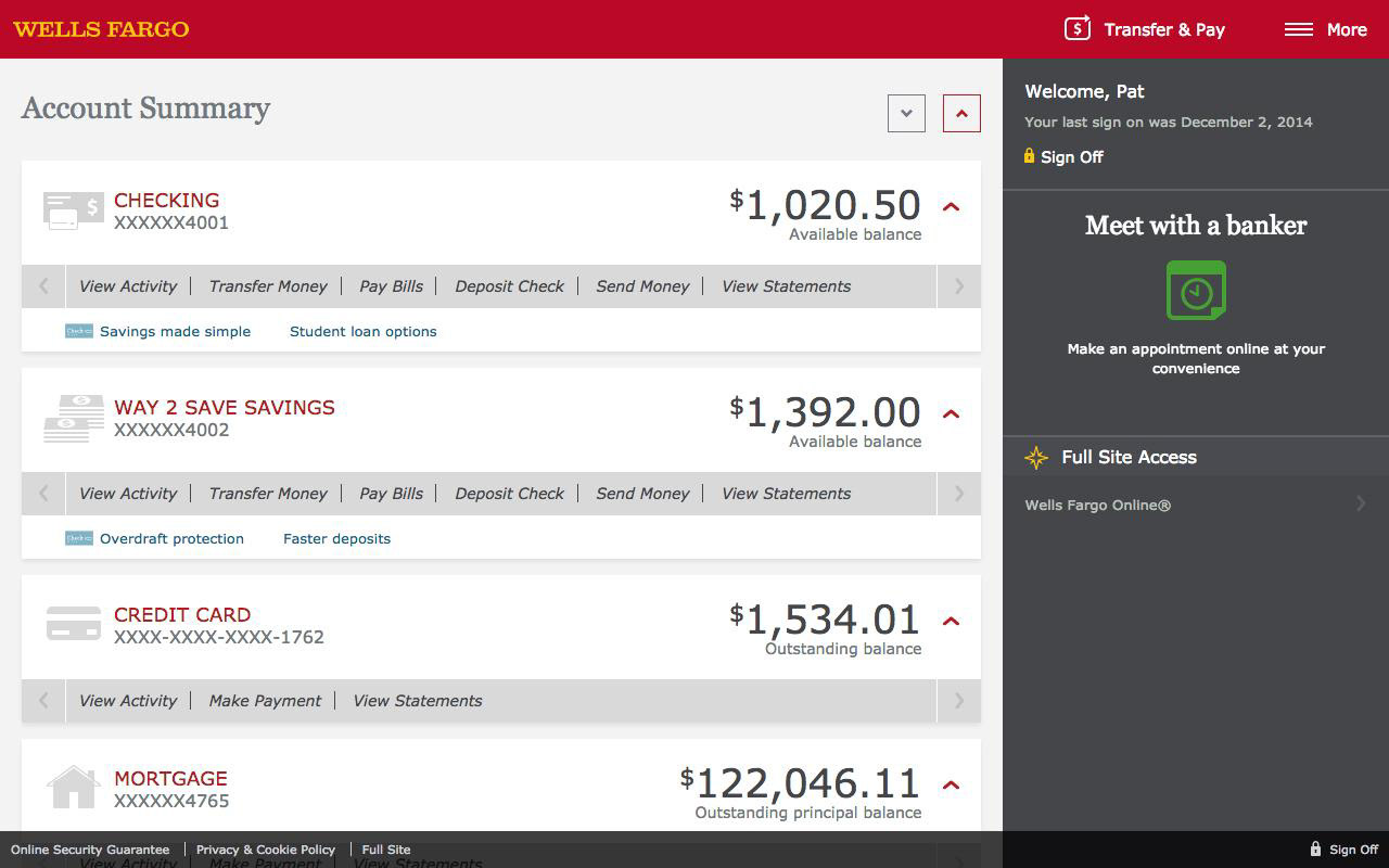
Analysis of existing pages
1) The primary navigation not clear enough.
2) The “upsells” like credit cards and rewards should be relegated to another area of the site.
3) Under accounts, there should be a “simplified” display with the option to “see more”.
4) The lack of color variety makes it difficult to find specific information.
5) There are too many links in sidebar.
Sketches

Design (Round 1)

Feedback from Round 1
1) Move “Switch Account” to left below account name.
2) Change “Switch Account” to “View Another Account”.
3) Change color of links under “Pay Bills” to de-emphasize them.
4) Rearrange dollar amounts at top to put focus on what’s most important.
5) Tighten space in account summary.
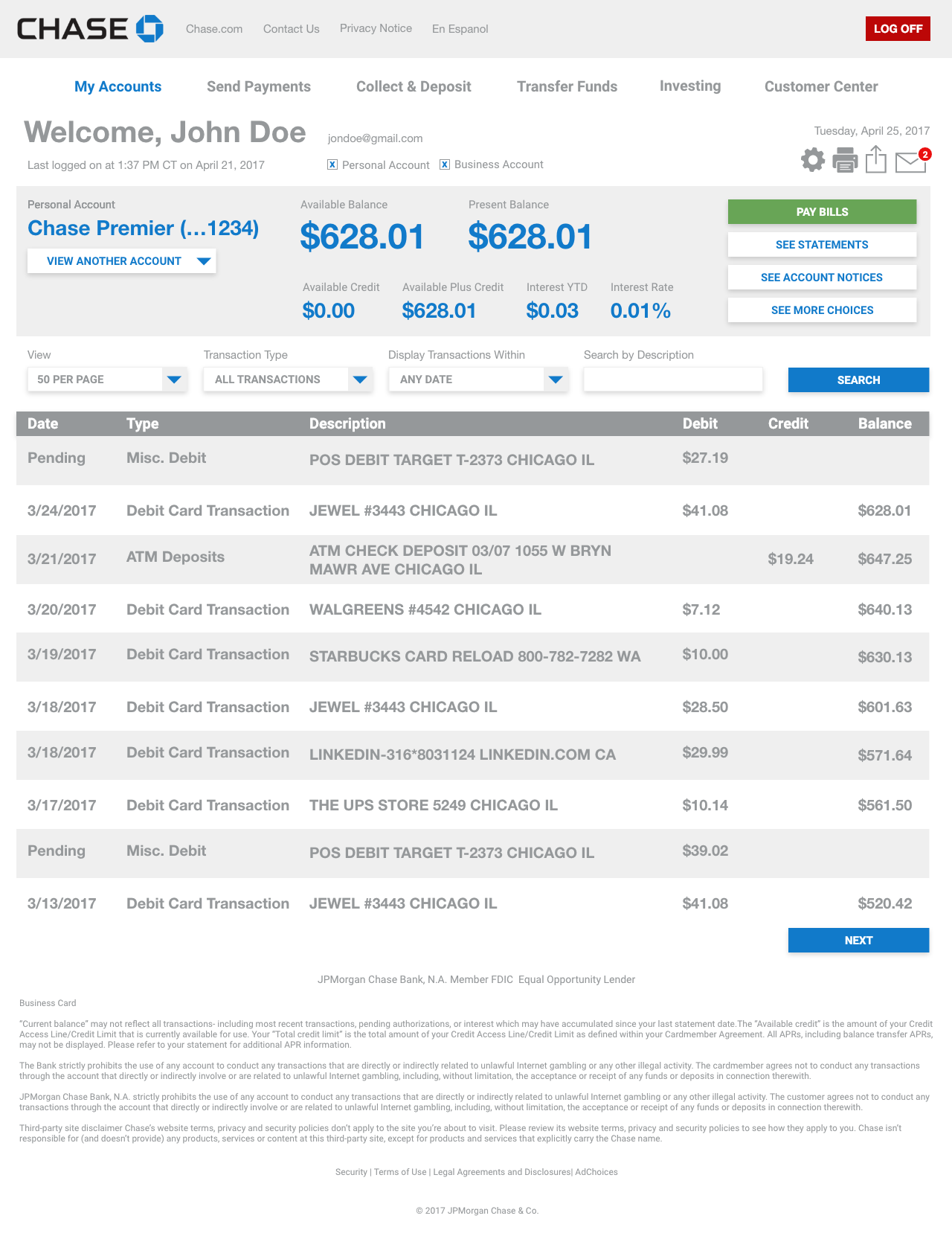
Design (Round 2)

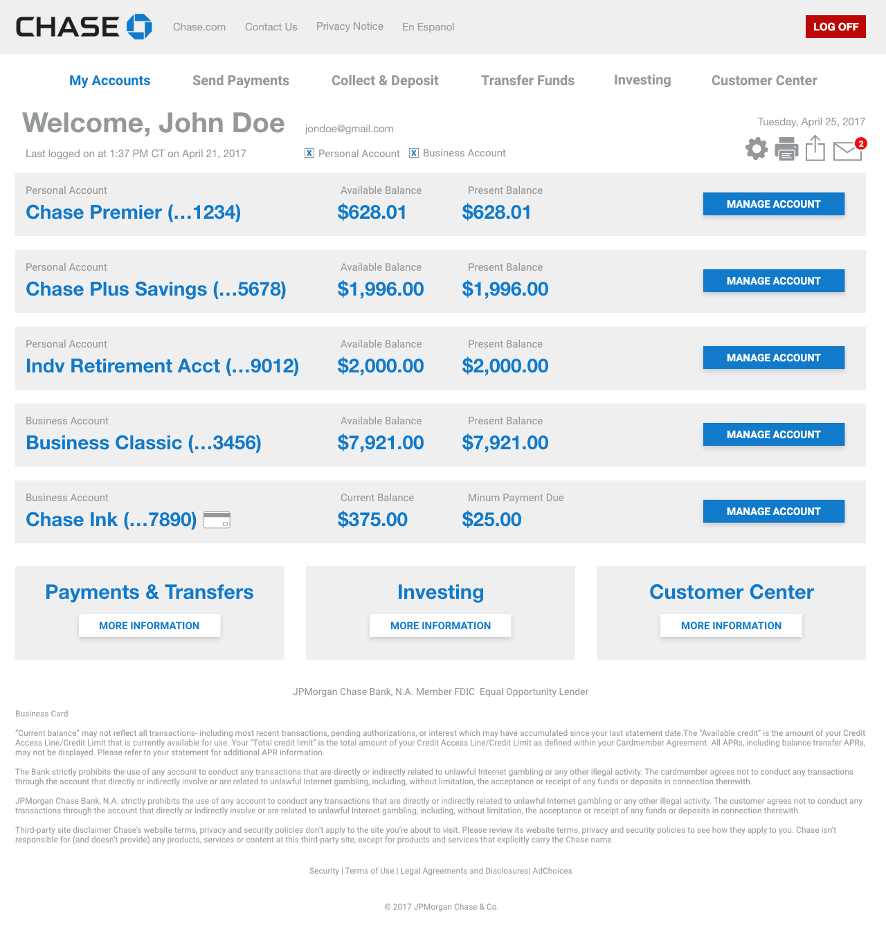
Final Designs

Demo